This fall, we worked with The Root Social Justice Center in Brattleboro, Vermont to design a visual identity. I was excited to be part of this project, as The Root’s focus is providing space for racial justice organizing.
As a person of color living in one of the whitest states in America, I have felt deeply the paradoxical dynamics of erasure (“we don’t need to think about white supremacy because everyone is white here”) and extreme visibility (I think I might be one of two Asian women who live in my small town, so not much I do goes unnoticed). When I first connected with The Root I learned that, upon moving to the state, googling “people of color in Vermont” is something that every. Single. One of us. Does. So I was grateful to find out that an organization like this exists.
The project unfolded in a conflicted moment. The Root was about to celebrate its 5th anniversary, and had a lot of beautiful community organizing work to be proud of. But with DACA in jeopardy, an increase in ICE (Immigration & Customs Enforcement) raids, and the “Muslim ban,” there was also a lot of rage, fear, and resolve to fight.

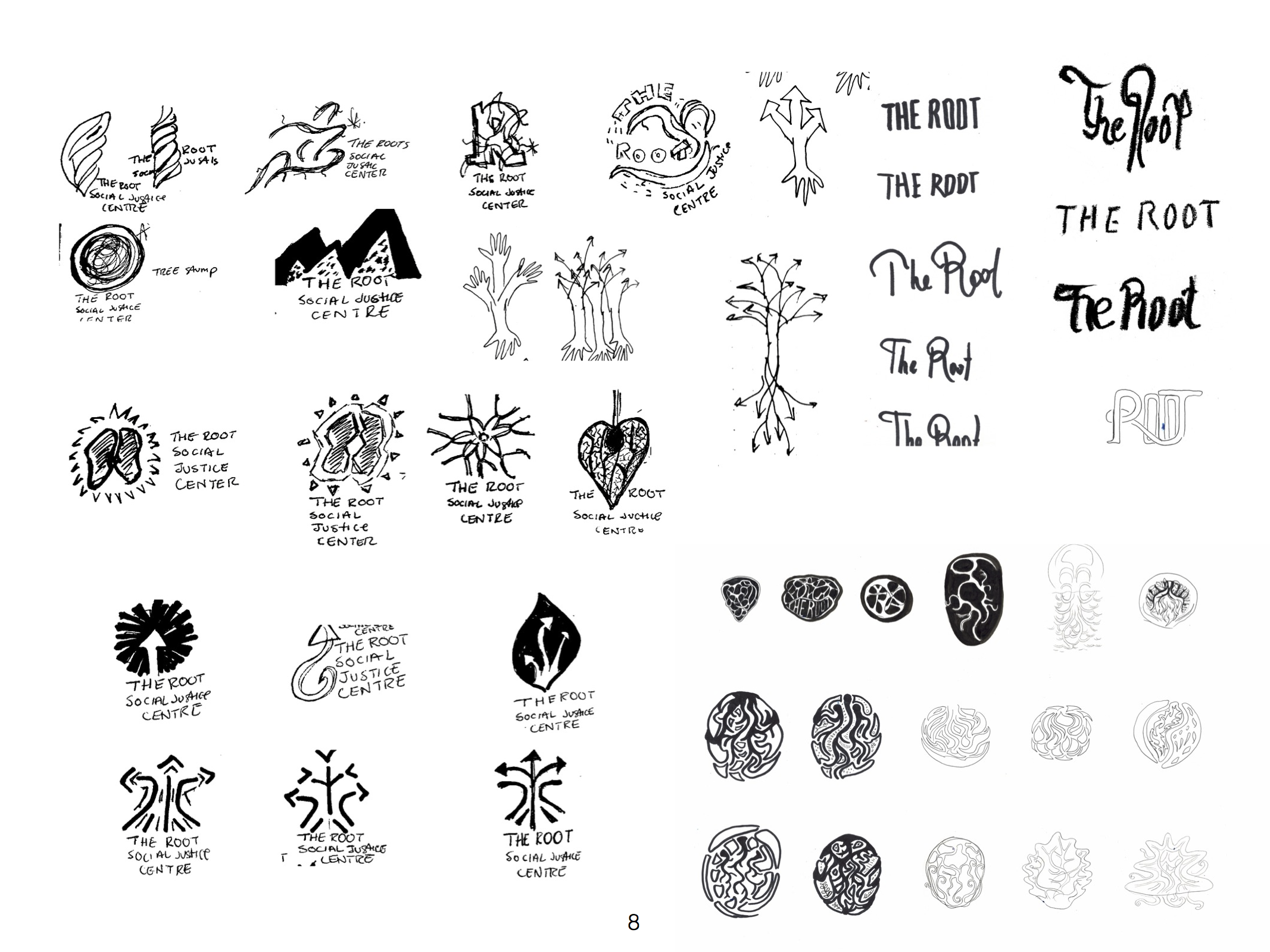
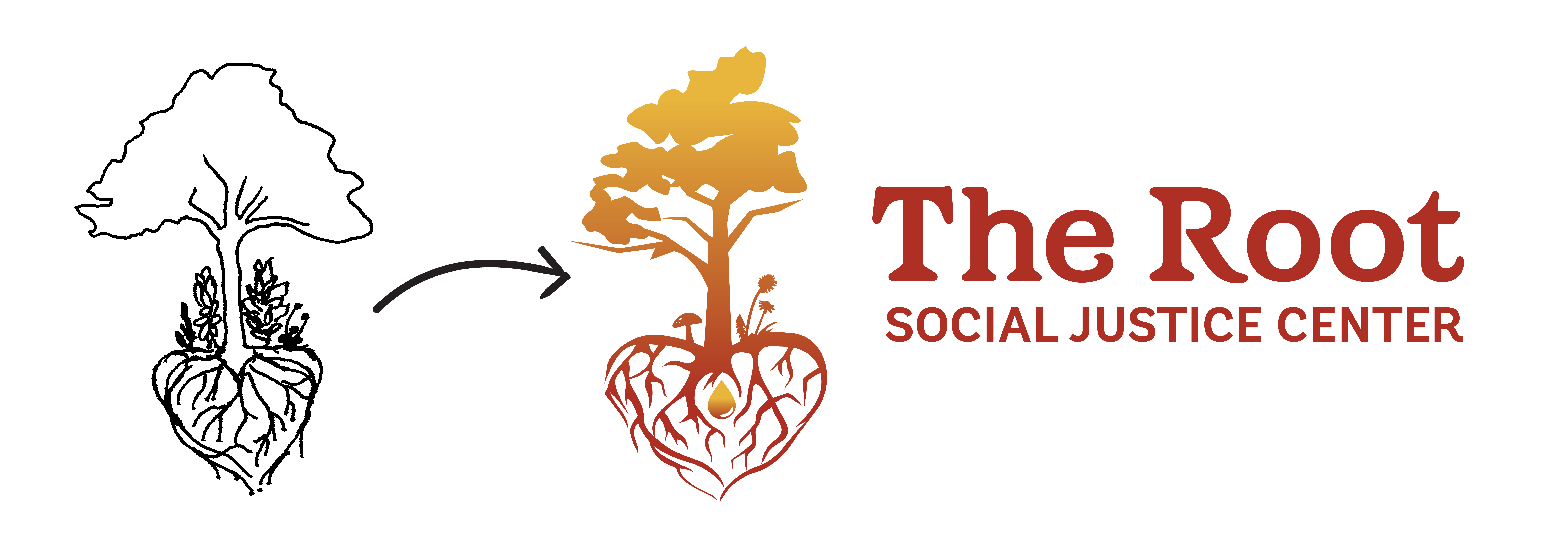
The feedback we received on our ideas reflected this tension in tone and emphasis — while it was important to communicate love and healing, there was also an urgency in putting forth a powerful message of resistance. In the end, after a couple rounds of creative, lots of discussion, and a revised design brief, the collective opted for an image of a tree with roots that formed a heart, wrapping around a droplet of water.

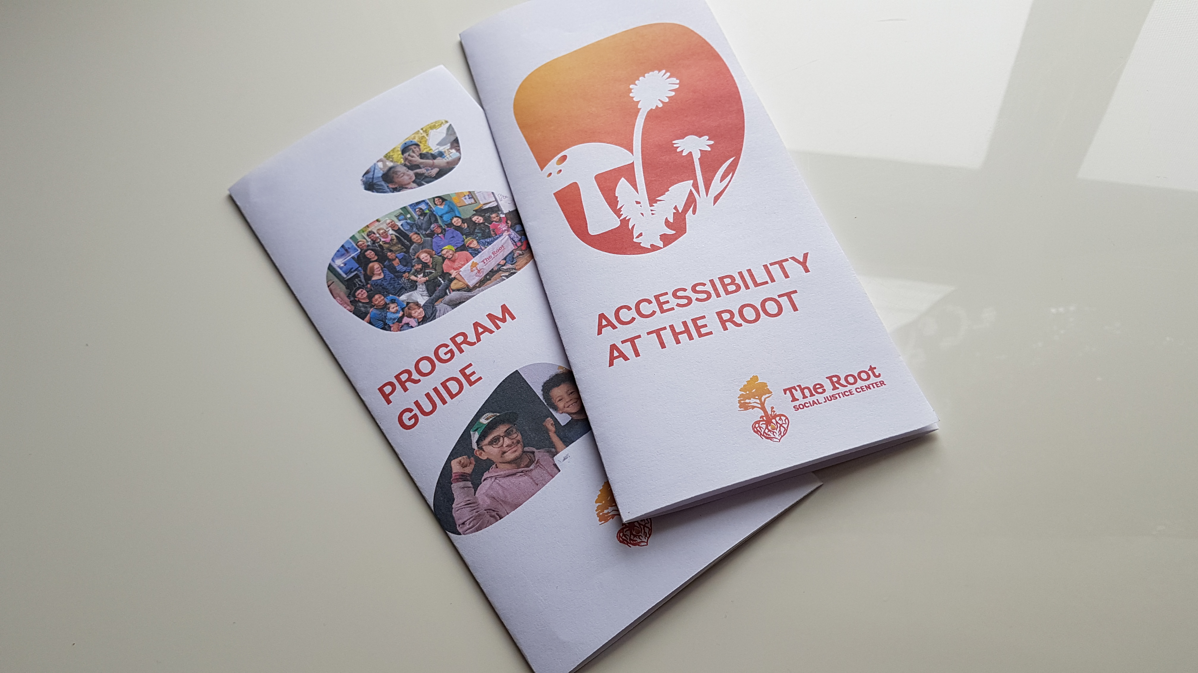
The new logo is inspired by activist artistry, but has also been designed to reach out to those who are new to organizing. The imagery honors Vermonters’ connection to the earth while undermining colonial narratives of racialized people being absent from rural landscapes in the US. The rust red symbolizes resistance, while the gradient moving up into gold speaks to the hope signalled by Vermont’s sunrises. The dandelions and toadstool are symbols of diversity — a forest isn’t just made up of trees. The typefaces — Barcelona and Andes — were selected for their humanistic feel.

We have so much gratitude for the work The Root is doing. Please support them by donating or if you are in Vermont, participating in one of their amazing programs.