Translating complex ideas into visual language is a graphic designer’s recurrent mission. As social communicators working for design justice, this mission becomes more pressing: while the issues that individuals face require urgent attention, we must never lose sight of how those concerns stem from larger systems of oppression. How can graphic design help express the complexity of injustice? And, can graphic design be used to devise an approach towards justice? These were the questions that guided our process when designing the 2016 Annual Report for the Office of the Provincial Advocate for Children and Youth.
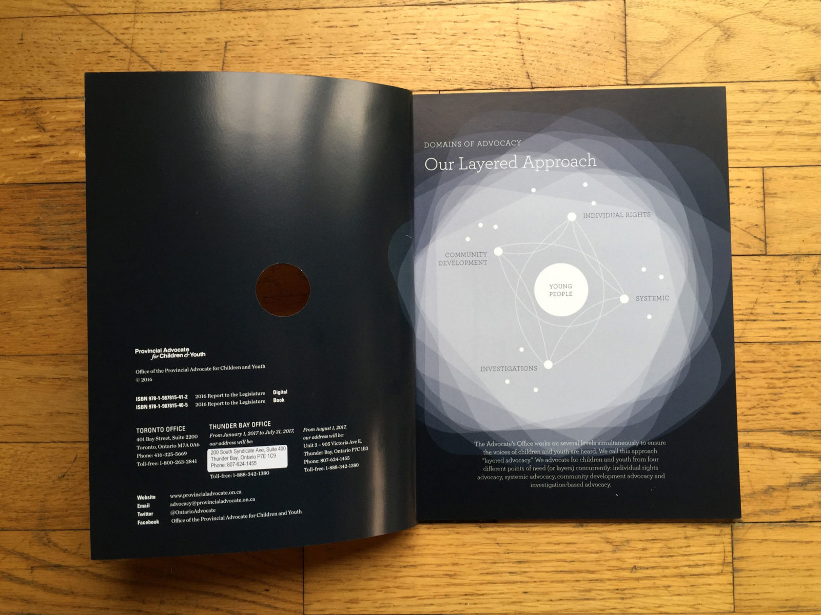
For this project, we needed to communicate what the Office does and how: that is, we needed to demonstrate why a “layered” approach to advocacy work is critical to address both the violation of individual young people’s rights and the systemic issues that give rise to these violations in the first place. Thus the Office exercises its mandate in a holistic way, doing work that simultaneously targets children’s needs through individual rights advocacy, systemic advocacy, community development advocacy and investigation-based advocacy.
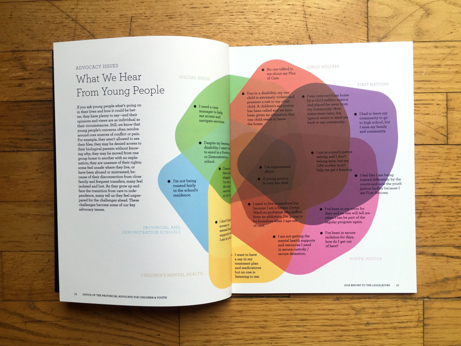
The challenge for us was to depict how each of the six mandate areas—First Nations, Special Needs, Child Welfare, Youth Justice, Provincial & Demonstration Schools, and Children’s Mental Health—are important in their own right, given that young people in these areas face various and unique barriers. However, it also meant being mindful of conveying the interrelationships between these mandate areas, so as to signal why intersectional advocacy work leads to more effective responses towards violations of young people’s rights. This challenge led to a complex and at times messy collaboration, as we worked closely with the Office’s director and communications team on a creative approach to the complex nature of injustice, and the advocacy work that it necessitates.
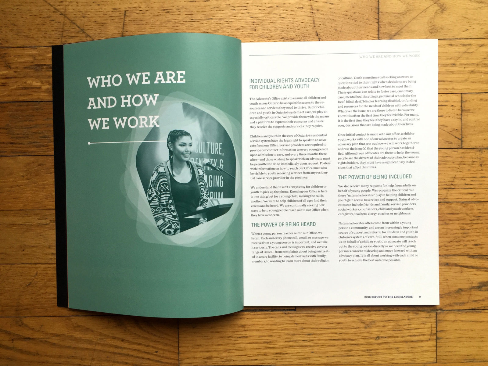
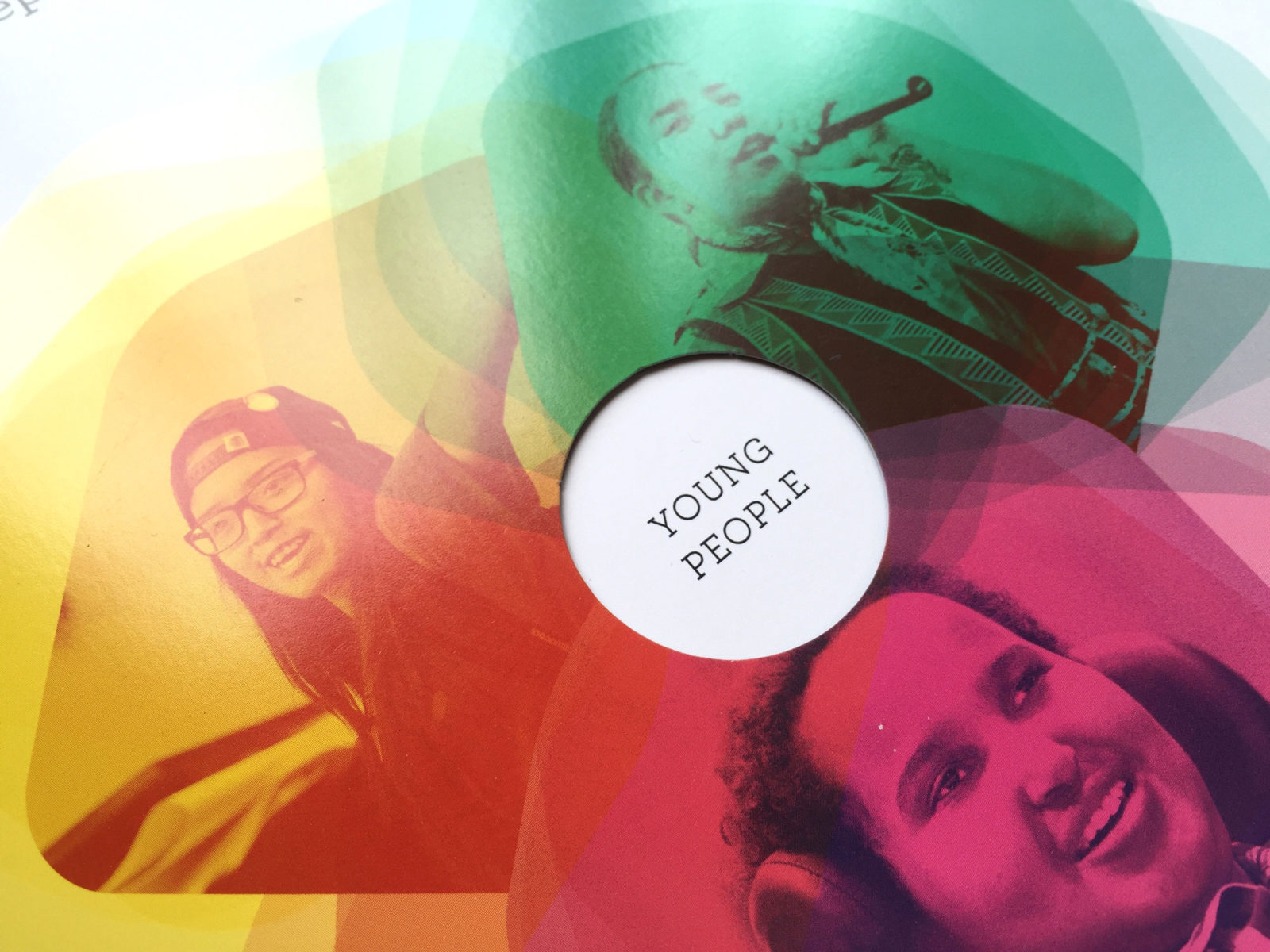
For each of the Office’s mandate areas, we created a distinct, organic shape to represent the advocacy work being done in that particular field. These shapes were used throughout the report to introduce the projects underway in that mandate area. We placed photos of young people at the center of these shapes, as a way to highlight their partnership with the Office, with their voices being at the heart of advocacy work.
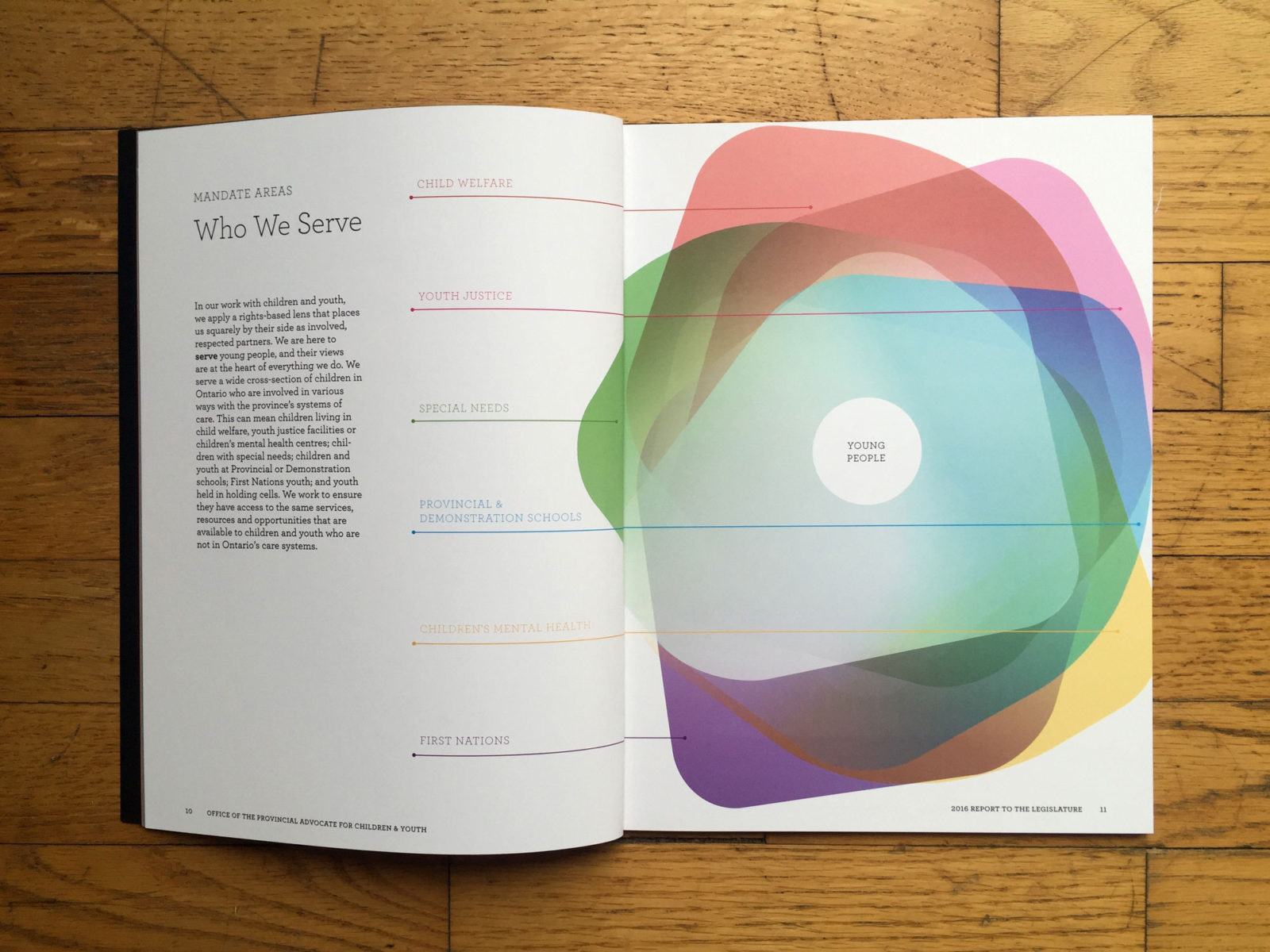
Infographics proved vital in conveying the uniqueness of the Office’s process, to demonstrate that children and youth in care face difficulties that must be addressed in a holistic manner. To represent the intersectional nature of advocacy work, we layered the shapes for the mandate areas over each other, such that their overlaps could give way to new colors and shapes. These overlaps inspire thinking about young people’s rights in a relational way. For the infographic “What We Hear From Young People,” the overlaps were paired with quotes from young people, their voices speaking of situations that pertain to a bigger, more complex reality.
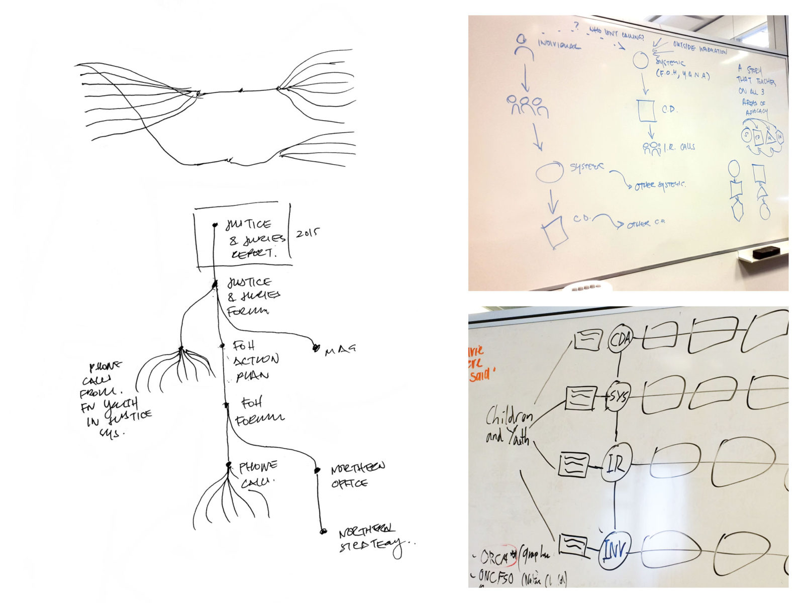
These infographics were the most difficult to pin down, with several staff members from the Advocate’s Office and three designers from our studio working on them simultaneously. The number of collaborators, along with the crossover of participants’ expertises, meant going through several design iterations, and experiencing moments of uncertainty and exhaustion as we tried to convey this information with clarity and interest. Ultimately, this collaboration made for a more solid design outcome. It reminded us again why embracing those moments of chaos—inherent in co-design initiatives—can actually lead to stronger design ideas, as people with different backgrounds and viewpoints are encouraged to partake in the process.
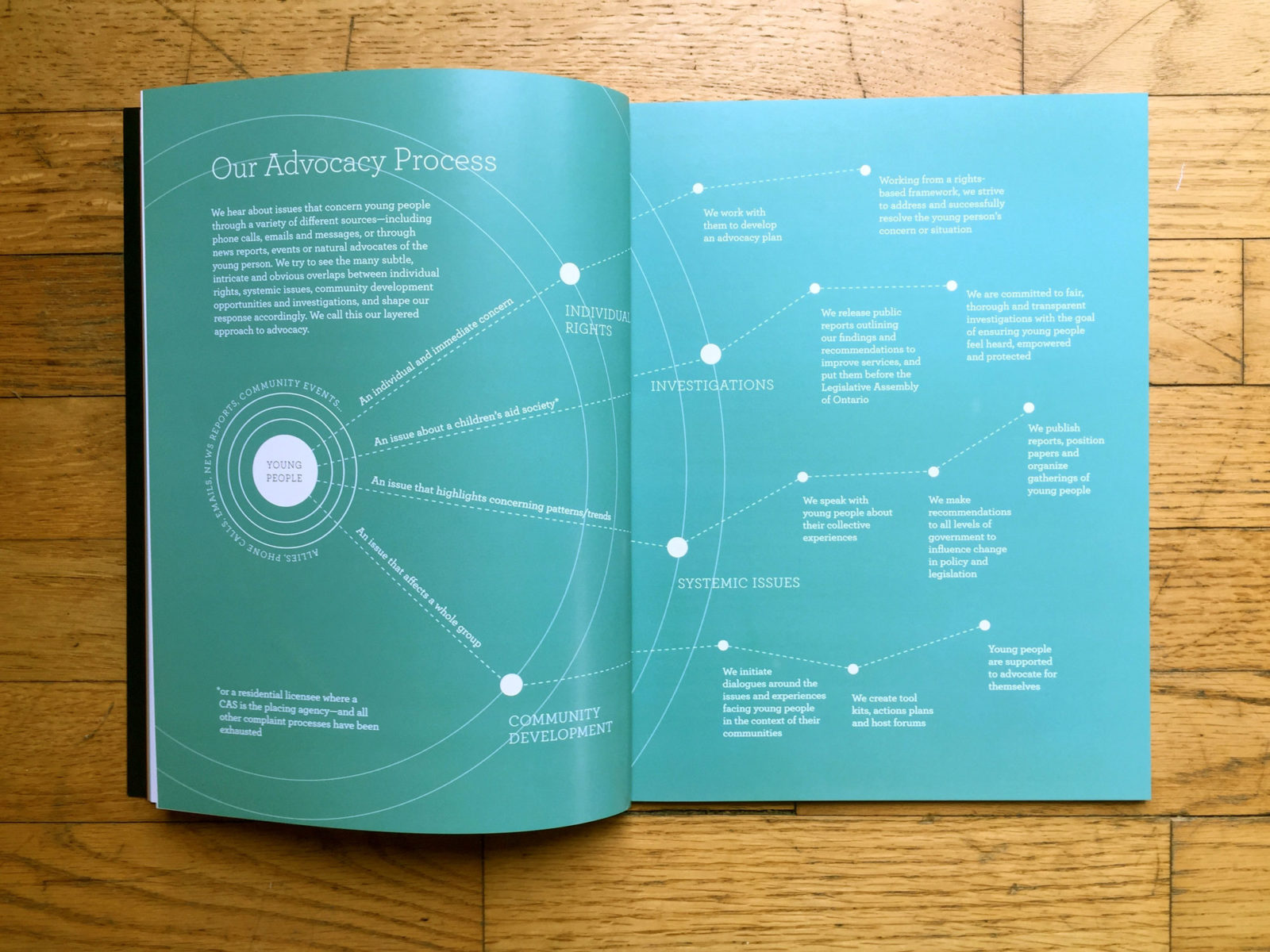
We also co-designed a series of infographics that help explain the various ways by which young people can reach the Office to raise their concerns, and how the advocacy process builds from there. The information was organized in a constellation fashion, each advocacy area sparking directly from young people’s needs.
Designing the 2016 Annual Report was at times a daunting mission, confronting us with the need to re-examine the visual languages we employ when speaking of injustice. But ultimately, this project also hinted to us the potential of graphic design to visualize justice: to the realization that visual tools can do much more than simply help us pin-down the challenges we face in the world. Indeed, design can—and should!—be a means for richer, more interrelated thinking and action towards a thriving world. With this in mind, there also arises the warm certainty that co-designing images and approaches for the world in which we want to live entails opening up to honest exchange, to re-discovery, and to beautiful mess.