In August of 2015, the Office of the Provincial Advocate for Children and Youth (OPACY) released It’s a Matter of Time: Systematic Review of Secure Isolation in Ontario Youth Justice Facilities. The report was designed by And Also Too.
The objective of the report was to raise awareness of the existence of secure isolation (SI) in youth custody/youth detention facilities in Ontario, as well as the conditions of and length of time young people were held in secure isolation. The Child and Family Service Act specifies that young people under the age of 16 years cannot be kept in SI for more than 8 hours in any one day or 24 hours in any one week. SI for those 16 years of age or older cannot be exceed 72 hours unless approved by a provincial director. In 2011, the UN Special Rapporteur on Torture called for an absolute prohibition on the use of solitary confinement (defined as periods of 22 hours per day or longer) for juveniles. In 2009, SI was used for youth in Ontario for more than 24 hours on 415 occasions, and in 2014 on 164 occasions. Young people have spoken of how difficult SI is to endure; many describing the experience as “inhumane”. Youth reported a lack of opportunities for any mental stimulation, a lack of cell cleanliness including the presence of bugs and previous occupants’ bodily fluids. Youth also stated the cells were cold, they did not always receive enough to eat, and that they were denied access to showers and fresh air. The report strives to educate people about regulations around SI and how those regulations are or are not being followed across the province, with the goal of changing the current practices and use of secure isolation youth justice facilities in Ontario.
The process of putting together this report began in 2009, with advocates from OPACY conducting interviews with young people in detention. This resulted in the accumulation of significant amounts of data on frequency, length, and conditions of SI in Ontario facilities. Thus, at the onset of the project, visualizing this data was identified as instrumental to the impact of the report.
Creating these visualizations was a unique learning experience for our studio; an opportunity to hone skills while working out creative workflows and establishing a strong sense of our team. We wanted to share some of the story of how the raw data developed into the graphic visualizations that can be seen in the report design, covering how we worked with the raw data, how we refined the visualizations for aesthetic appeal and at-a-glance readability, as well as some of the challenges that came up.


Skills Building, Team Building
At the start of this work, the team members were all working in different locations; Una Lee in Toronto, Lara Stefanovich-Thomson in Kingston Ontario, and Gracen Brilmyer in Oakland. Being apart posed challenges, but also meant that we fully appreciated our time when we were all eventually in studio together.
Some of the tools we used to produce this report and keep us connected were:
Basecamp (project management), Excel (data capture), Processing (raw data visualizations), Illustrator (data visualization refinements), and InDesign (layout design)
Working with the Raw Data
After reading through the data and the text of the report, Lara identified the sets of information that could potentially be displayed through data visualization. OPACY prioritized the options on the list, and we began by working with the highest priority data sets. We also completed the preliminary design and layout of the report so we had a sense of the styling and dimensions of the completed visualizations.
OPACY reviewed the use of SI use in twenty-one Ontario youth justice facilities using statistical information and log data from the Ministry of Children and Youth Services for the periods 2009–2010, 2013, and 2014, the 2012 Auditor General of Ontario Report on youth justice services in Ontario, and 141 youth interviews. Because the data set was very large and eleven questions would be addressed with visualizations, Una proposed using Processing, a lightweight coding language for visual and artistic outputs. Processing can graphically translate large amounts of data with mathematical accuracy and promote a good understanding of the data content. Creating the visualizations manually would be very time-intensive, while Processing would allow us to easily explore different ways the data could take shape. Additionally, Processing can output vector-based PDF files that can be brought into Illustrator for refinement which would aid our workflow.
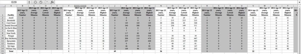
Gracen, with a strong background in digital archives and programming, concentrated on learning Processing. To begin, we exported the Excel tables to Processing-friendly CSV files. Setting up, cleaning, and sorting the data correctly would be an essential step in the flow of work and help us delve deeper into the content of the report.
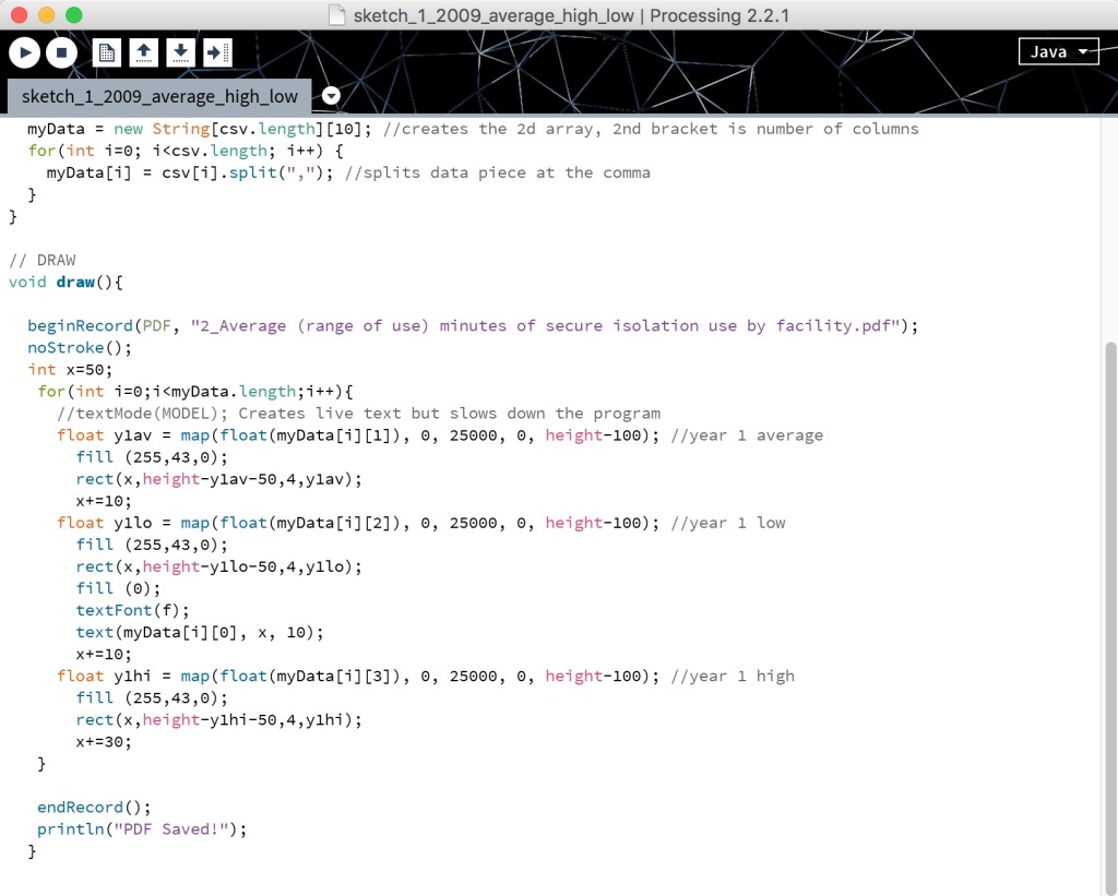
Once this was accomplished, Una and Gracen wrote an initial Processing script that Gracen could then edit and adjust as required by the parameters of each additional visualization. Rough visualizations were created. Gracen recalls “Initially, we used the Processing visualizations to get a high-level view of the data — what did the numbers actually look like when visualized as a bar or line graph and how might that influence the overall layout we were designing. I could easily import the data into Processing and quickly style it to be able to differentiate between data. In Processing, I could open a file, and run a basic loop over the data, setting different parameters, like style, x- and y-axis, and text.” From the rough first outputs, layers of information were added to build up the dimensions and complexity of the designs.
Tip: Try Processing and check out other data visualization apps.
https://processing.org/tutorials/
http://learningprocessing.com/
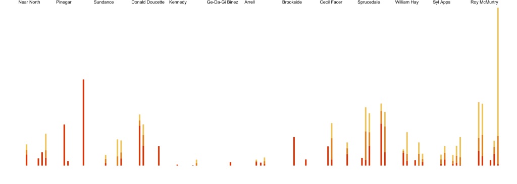
Initial visualizations from Processing
The Refinement Process
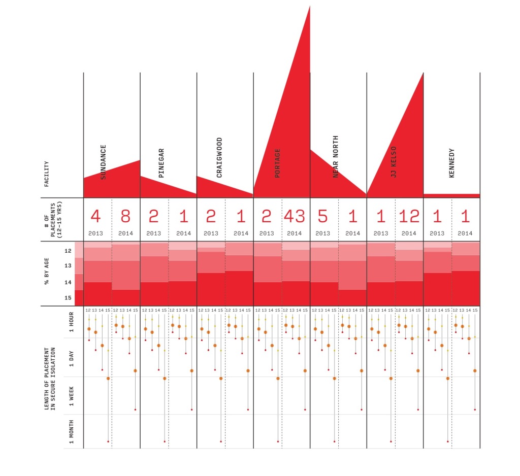
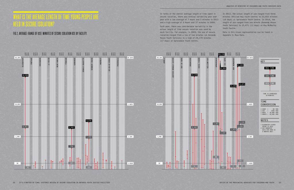
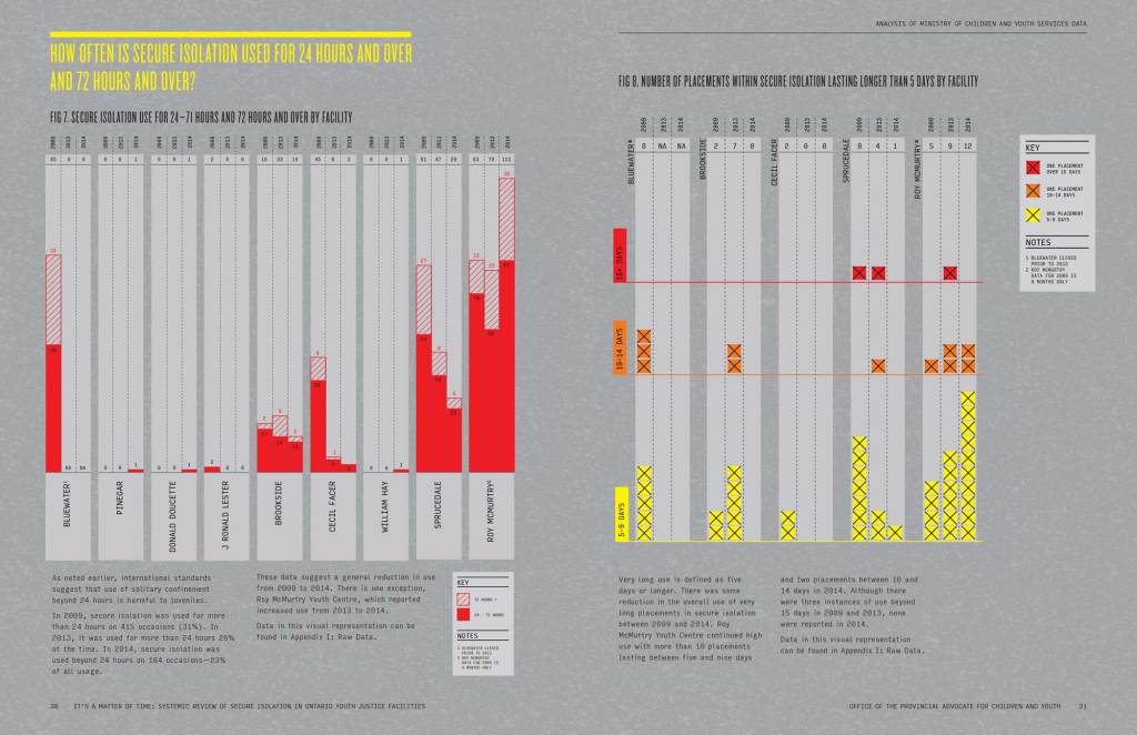
The questions the report would address were: How often is secure isolation used at each facility? What is the average length of time young people are held in secure isolation? Does the number of youth at a facility make any difference to the use of secure isolation? What is the age of the young people in secure isolation? Are facilities following the rules for young people under age 16 years? What can we say about the use of secure isolation for those under 16 years of age? How often is secure isolation used for 24 hours and over and 72 hours and over? Are there any discernible patterns between facilities?
It took a significant amount of time per data set to a) figure out the strongest visualization for the data, b) wrestle with the enormous variation between variables and c) get it to work in our programming language. Una spent time meeting with the client at this point to nail down the direction of each visualization. And our Basecamp discussions began to be centred on evaluating the approaches used for each data visualization and seeing if the story of the report was being told effectively with the graphics. Una led the direction of our design work, Gracen had the most familiarity with the data sets, and Lara had spent the most time with the text so we brought our different perspectives to the creative discussion. We tried to ask the hard questions and were committed to researching, experimenting, and reworking to get each one right.
Tip: Keep returning to original goals to evaluate the visualization at each step of designing.
Questions arose such as: How can we group different pieces of information to show correlations or lack thereof more quickly? Can we create pieces that do not always require the reader to use a key? Which data should be highlighted to best tell the narrative of the report? How do we address some visualizations with larger ranging data sets? How do we represent no data?
Addressing Challenges
Data was categorized in time-based, youth placement-based, and number of placements-based information, organized by age, by facility, by year. Each visualization showed varying combinations of the data. Different challenges came to the forefront as we worked. One example of this was how to address the wide range of minimum and maximum time spent by youth in secure isolation. In 2013, William Hay Youth Centre the minimum SI placement for a youth was three minutes and the maximum 23,655 minutes (16 days). In 2009, the minimum-maximum range at Kennedy House Youth Services was two minutes and 24,170 minutes (17 days). At Roy McMurtry Youth Centre the range was a minimum of one minute and a maximum of 15,671 minutes (11 days) in 2014. All these maximums dwarf the recommended maximums for 16 years or older of 4320 minutes (72 hours/3 days). And we know that even 2 days in SI for a young person is very harmful. Visualizing two minutes and 17 days together was challenging. Gracen spoke of how this problem was negotiated: “I used Processing to mathematically adjust the axis intervals to compress each subset of time differently (hour, day, week, month) to make the amounts easier to compare. Although it is not a 1-to-1 comparison of minutes, we essentially stretched smaller increments, such as minutes in an hour, and compressed the scale for minutes in a week (and even more so in a month) so that a user can easily and clearly see all of the data.” This can be seen in Figures 2 and 6 of the report.
The layout design developed alongside work on the visualizations and aesthetic decisions were made to help the reader see patterns within the data. A strong and appropriate colour palette was chosen. Consistency in colour with yellow for low, orange for medium, and red for high was utilized, and attention to labels was given to minimize searching for information and having the viewer do unnecessary work to gain clear understanding.
At each draft, more feedback was received by the client and the visualizations were fine-tuned. Fresh eyes are always beneficial during revisions. Una advised the client to show the final visualizations to a number of people who had not yet seen them. Una offered some pointers:
- Print each visualization in colour on 11×17
- Show to someone who hasn’t seen it before. Don’t ask “what do you think of this?” — instead ask “please think aloud as you look at this.” You’ll be able to hear people’s analysis of the visualization and know whether the points you’ve made in the report are coming across. You’ll also be able to hear where they are unclear on anything.
This way of drawing out feedback helps show the visualization entry points and the narrative flow of the design, and helps to see if viewers are seeing the big picture as well as picking up details of information.
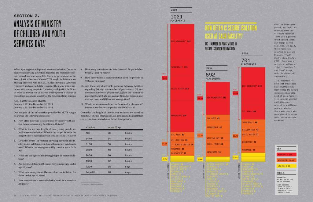
Feedback included adjusting contrast to increase legibility, highlighting the hour-week-day line markers and giving attention to the legend information details. The client also discussed bolding titles, changing some type colour and pattern choices, and adding more detailed labelling. In Figure 1, the client asked for more explorations of how to extend the low/yellow section of the bar graphs, which lead to information being extended beyond the box outline. Other refinements for this visualization included darkening the background by 5% and brightening the yellow type, as well as adding low, medium, and high use facility labels. Figures 7 and 8 were reconfigured, combining figures to produce a visualization that now answered the question: How often is secure isolation used for 24 hours and over and 72 hours and over by facility. Followed by a second visualization that showed the number of placements lasting longer than five days. In Figure 7 a bar graph were used to distinguish the two ranges of time, in Figure 8 Xs instead of a bar graph was used to present the number of placements, with colour coding used to easily register low, medium, and high lengths of time for youth in SI units.
Tip: Get people with fresh eyes to look at the design and talk their way through their experience of it as part of your evaluation process.
Pulling it all together
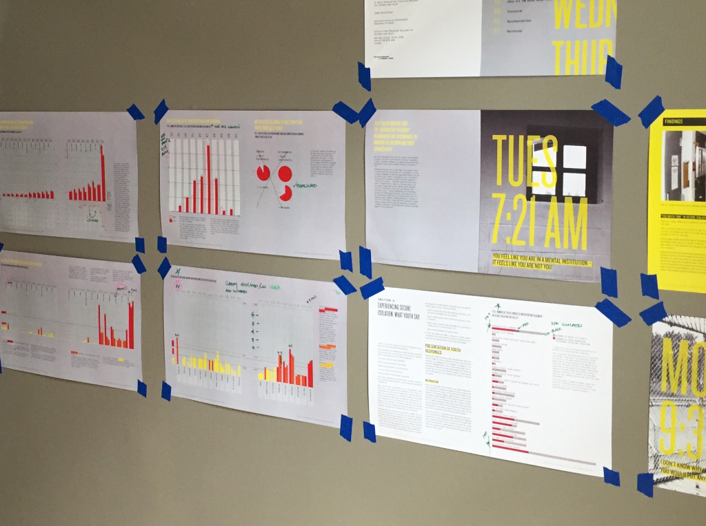
To evaluate the visualizations for consistency and cohesiveness, we printed them out and posted them on our studio wall. This allowed us to step back and see the full picture and assess how well the visualizations were working as a whole to tell the story of the experiences of young people in SI. Una made final design decisions, while Gracen and Lara addressed all the revision details, marking the changes on the prints on our walls to keep us on track and organized together. Following the final client reviews, data was reexamined for accuracy, colour contrasts were increased to improve legibility, and legends were double-checked. We worked and bonded as a team drinking delicious coffees, working out details in Illustrator, and getting it all done.
Tip: Don’t forget to print out work at 100%. It helps to put work up on the wall so you can step back and have a final look.
The final report can be seen here.
We are proud of the design of the It’s a Matter of Time report that increased the understanding of the use of secure isolation in youth justice facilities in Ontario. We all felt very privileged to be able to contribute to this work. The report release received great media coverage some of which can be seen here:
http://www.cbc.ca/news/canada/thunder-bay/youth-in-solitary-confinement-ontario-child-advocate-calls-for-change-1.3196191, https://www.thestar.com/news/crime/2015/08/19/end-solitary-confinement-for-youth-in-custody-longer-than-24-hours-report-urges.html, http://www.macleans.ca/news/canada/why-do-we-still-put-young-people-in-solitary-confinement/.
Other Processing and Data Visualization resources: